Kompost does titles for Trekant


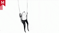
This title sequence by Kompost breaks away from 3D and vector, taking a more illustrative route. The narrative itself is also quite clever, combining both the figurative and literal meanings of Trekant (triangle or threesome).

Good character design is blazing hot right now in the motion graphics world…makes me wish I had taken some illustration courses.

14 Comments

MHR

This is really nice. Aside from the Mario Bros.-esque narrative (which is fun to follow), I am really drawn to the construction of the piece. The layered watercolor background and sketchy illustration really give this a humanistic perspective – almost tactile. Its always refreshing to see work produced “outside” of the computer.

r3awak3n

really awesome, the idea is great and the style is fantastic. Agree with you john, character design is in right now!

jo3

Not to be a debbie downer, the title sequence looks great, and as much as I love watercolor, I am really getting tired of it. Its overused in my opinion, I saw it start with the Inkblots in NAKD’s crazy for gnarls barkley, and it has spread to everything else, it seems like, I could be wrong. I have seen it in really awful tv commercials, to nice stuff like this.

I think it has gotten to a point where, we have nothing else to put in this? it looks kind of bland?, how about some watercolor to make it look more complete.

Just my 2 cents

two.oh

I don’t think it’s to say that something is ‘overused’ when the purpose of the style isn’t about following a trend.

If it fits for the purpose of the film, then I think it did its job.

Marc B.

jo3, i don’t think Nakd has anything to do with gnarls barkley’s “crazy”. It was done by blind.

CalCreole

As a member of the Blind team, I just want to confirm that yes… we designed and animated the Gnarles Barkley “Crazy” video directed by Robert Hales.

Babe

Simple, beautiful, fun.. I love it!

MHR

Exactly, two.oh.

When I saw Kyle Cooper speak in Savannah, he commented on that exact thing – adopting a style because it’s aesthetically pleasing doesn’t make it appropriate for every work [referencing his Seven title]. Keeping visual construction and attitude relevant to the concept of any work is obviously crucial to creating a successful piece. I hope here that the theme of the film warranted the visual mood of the sequence (dark watercolors), because it at least supports the soundtrack.
And yeah, just because something is done with watercolors (which has been used for hundreds of years) doesn’t mean it’s the “Gnarls Barkley style”. I think there’s room for growth and individuality in every genre of fine art when applied to motion graphics – its those that copy senselessly that turn them into trends.

nana3115

I loved it! Its simple and compelling. A++

yvo-k

Trés beau travail, autant dans le design des personnages que dans son animation ,et ses couleurs,le script aussi de cet antiheros donne une touche particulierement drole et attachant .bravo !!….

jo3

sorry for the mistake, i meant bl:nd, i remembered incorrectly. i didnt mean to imply this sequence has crazy’s style, just that i hadn’t seen too much watercolor in motion graphics before it, and now i seem to see it everywhere. i know crazy is supposed to be inkblots, but it looks awful watercolory. its probably just me noticing it being used more often than i used to.

im not being critical of this sequence, i think its great, i was just stating what i thought about the usage of watercolor.

ddaker

What I really enjoy is the realistic body movement, afterfx cs3 will have that puppet gizmo…I’ll bet it would have cut down production team a whole lot on that animation.

there’s a lot going on in this piece, a lot more than some other visual treats, this one has a narrative and a dollop of mystery, and its all backed by fluid motion, thematic bg’s and an O’ so sweet music track.

love it!

Joe Clay

By the way, Gnarls Barkley is, as you said jo3, more like inkblots. However, as far as I can tell, it’s purely digital, which makes it nothing at all like this watercolor treatment.

I’ve been doing work with watercolor and, more specifically, Arches watercolor paper, and I like the texture it gives to the work. I don’t think it’s overdone either—I think it’s really underused.

Ben

love the atmosphere for this title sequence. Has a very cool painterly effect to it!

Comments are closed.