Stardust for Paulig Presidentti

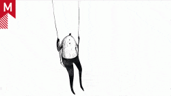
It’s been a while since we’ve posted work by Stardust, and I’ve missed their polished style. Their triumphant return to Motionographer’s humble spotlight is with this lushly detailed, fluidly animated spot for Finland’s premier coffee brand, Paulig Presidentti.

paulig.jpg

What I find interesting about this spot is the conspicuous absence of the favorite color of all coffee ads: brown. Instead the comps are suffused with olive greens and deep golds. It’s a refreshing change. And I doubt very seriously that the transitions could have been executed any better. Super silky smooth.

Here’s a tidbit from the press release:

With the job awarded, work began quickly, involving a great deal of interaction between New York and Helsinki. To develop the project, create and master their final animation, Stardust’s artists used Maya, Real Flow and Adobe After Effects, as well as a 2D equivalent to traditional cel animation. As the work progressed, motion tests and other materials were posted for review every couple of days. ‘There was constant feedback,â€? Bibby said, “and as everything came together, they were really happy. It became a total labor of love for everyone involved, and the artists kept working on it until it was the level that everyone wanted to see.â€?

I always find it admirable when a client can keep that close to the studio without micromanaging the project into the ground. Obviously Stardust and agency SEK & GREY had some pretty wicked mojo going. Makes all the difference in the world.

Full credits

About the author

Justin Cone

/ justincone.com
Together with Carlos El Asmar, Justin co-founded Motionographer, F5 and The Motion Awards. He currently lives in Austin, Texas with is wife, son and fluffball of a dog. Before taking on Motionographer full-time, Justin worked in various capacities at Psyop, NBC-Universal, Apple, Adobe and SCAD.

22 Comments

ddaker

Nice work Stardust!

Please could you guys reference how long this project took, from brief to delivery, just an estimate would do fine…are we talking about a few 3 weeks or something much longer? 2 months?

thanks guys

TheTofuFactory

Stardust never leaves me feeling unfinished.

Amazing work. I love the lighting effects, and the transitions are perfect. Keep bringing the work so I can get some inspiration.

I would also like to hear about how long this project took you to make and how many people were involved in terms of production.

Carl Mok

Time in production. 11 weeks. Last 6 weeks I was averaging 92+ hrs a week. 3 designers 5 3d\2d animators, 1 3D modeler, 1 producer. Steve Saunders art direction rocked it. Go steve!

ehrenk

wow transitions were really well done. great work.

KGB

Thanks for the info Mr. Mok
Wow…thats a huge crew you guys had…
Makes sense though since the spot is pretty “epic”.
Looks great.
I love how the bubbles rotate at the end, suggesting that the coffee was just poured/stirred.

Marc B.

(Hope this aint no doublepost)

I have to agree with some of the comments on feed in regards of the design. Few things could ve been subtracted in order to do other things a little better.

At times it feels very like the beautiful classic psyop bombay animation. The shapes used for the gold waterfall drips and especially the firework-shapes are identical to the shapes in psyop’s design. The bird is very similiar to psyops bird shot and the same can be said about the butterflies scene, pretty much like psyop’s version (even particles, trails, bursts included). And the seamless transitions strengthen my suspicion that the stardust team has been very inspired by psyop’s bombay spot.

It has some nice moments though. But to be honest. I get the impression that stardust is still seeking it’s visual identity and direction while heavily borrowing from other studios. First the hugo spot (ripping off motiontheory’s reebok) and now this one that seems rather like something psyop would do.

monovich

very nice work. I love how it moved so effortlessly from scene to scene. Interesting palette also. Shiny gold!

Joe Clay

Marc, it looks like they’ve seen it before, but I’m not sure about how many borrowed elements there are. The spots are totally different. They use two similar elements very differently—the bird and the butterflies.

However, psyop’s bird isn’t a Phoenix which makes sense in Stardust’s particle change into butterflies. I do think they were inspired, but I wouldn’t go any further than that.

troykooper

Awesome. I thought it was going to be a ‘Yellow Tail’ ad for sure. Defenitely unexpected for a coffe company. Stardust is great.

r3awak3n

I really like it, the colors are vivid and beautiful, the transitions are smooth, keeps your attention till the end. Great work by stardust.

People borrow ideas and concepts from each other, it is a normal thing to do. I mean, I bet psyop took ideas from other commercials/adds/books/videos in order to make their piece (which I have never seen)

jsaunders

Just to defend myself a bit, Psyops miller spots came out while we were in production on this, so it wasn’t really a matter of taking their idea, but them just being so damn good and beating Stardust to the punch. but thanks for the comments.

Marc B.

Hey jon
its funny you would mention the miller spots. Totally forgot about them. I guess you re referring to the one with the dragon and girl. Couldnt find it on their site anymore but i remember the yellow, golden tones and the galloping horse. Its indeed a little strange to see the galloping elk in your version now too. So many things now. Not sayin u were trying to rip them off but i guess you must have been dreaming of psyop :D

jsaunders

like I said, we were already half way through our production when that spot was revealed, so I guess I may have been having some foresight in my dreams, but if you want to think that I was ripping on them by all means, go ahead. It was just shitty timing for us really.

two.oh

honestly, i’m kind of tired of hearing comparisons of one spot mostly because it’s irrelevant and chances are it was never intentional. i think people get too wrapped up in trying to compare when they should really focus on the creative and concept.

yes, ideas are always derived from something, but honestly, who cares what it looks like?

the only important things to me in the end is if the client and director are happy, and if the spot did its job.

i think people who do boards should always ignore what people on the forums are going to say. that would only get in the way of the creative goal in my opinion.

e-tiq

i completely agree with two.oh.
this guys busted their asses for 11 weeks creating this beautifull peace and all you guys care is what other peace it reminds you off. get it together and go create! we are talking about stardust here, the same stardust you guys probably check everytime you start a nem project. geez

e-tiq

and sorry if i sounded too harsh but it’s really annoying

Marc B.

I didnt say it was totally bad. But we’re talking about stardust here. A big studio with lotsa money. If this was created by an individual only i’d say nothing. And jon brought up the miller reference himself and i then just remembered its other examples. Originally i was talking about the classic psyop bombay animation.

Again im not saying this is shit. But this is stardust, i gotta have the level raised a little.

Joe Clay

Well, if it was actually stealing a concept then the bar should be the same for all. I don’t see too much of a similarity. I don’t see them spending 11 weeks on it if they ripped it, you know? Marc, realize that I’m not saying that that’s what you’re saying here, I’m just putting it out there!

Yussef

whaddaya gotta do to impress people these days? pull a golden egg out of your ass?

troykooper

Sorry Yussef, Psyop aleadry did a golden egg. Hands off.

Marc B.

Let me clarify some things

I like stardust a lot. I think the spot is nice didnt say its total bs. I also didnt say they tried to rip anything but it seemed to me like they were very much inspired. But since its stardust i have to expect a little more from their creatives. The issue i’m talking about is that it feels very psyopish, style and not something stardust would do usually.

Stardust could ve used eggs, chickens, birds, butterflies, flowers, any object that psyop ever used. But IMHO its about how you visualize these things. I bet there would ve been a way to design these things a little different.
Two of psyops most recognizable works contain butterflies & flowers with seamless transitions, the bombay animation and sheryl crow video. Seeing butterflies animated like that in a stardust piece plus all the other examples i mentioned in my first post did make me a little sceptic.

Again i like stardust. Just tryin to be objective, not tryin to put anyone down. This is my opinion.

KGB

I have to disagree with you Marc.

Seamless transitions are less of a calling card of a particular post shop and more of a general concept, one that many try to achieve. What else would you use if you didn’t want to go for a cut or a simple fade?

The same goes for butterflies and flowers. They’re common objects that appear everywhere and are common elements in something that tries to talk about nature, etc…

Did the spots both have birds: yes
Did the spots both have butterflies: yes
But, I just think that the style, pacing, and use of the elements is completely unrelated between the spots.

Just my opinion here as well.

Comments are closed.