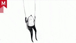
2007 AICP Show Open By Version 2

This beautiful open, by Version 2, was created for the 2007 AICP show that was held at the MOMA in New York on June 5th. Designed to the style of old surrealists like Magritte, this open is gracefully executed with a great sense of depth and smooth movement throughout.

aiga.jpg

Here is what they had to say about their process, “The environments were primarily digital matte paintings, created in Photoshop and then imported into Autodesk Inferno … The 3D was created in both Cinema 4D and Maya and combined with numerous 2D After Effects elements. To create depth on the foreground objects, everything was projected in Inferno onto 3D geometry.”

Check it

Also, Version 2 created a different animation for each show category, here are a few:

Single Commercial | Copywriting | Humor | Graphic Design

There are twenty-one categories in total, so go to Version 2’s site to view them.

About the author

Jon Saunders

/ www.jonsaunders.tv
internet surfer/designer extraordinaire

10 Comments

ev

so beautiful. amazing job

let’s go get some geeerrrylllls

seon

omg this is awesome!

THA_DON

The link from the thumbnail aint working right now.

By the way, where is all the cool stuff gone these days? More of the same is all I see these days. Either big robototic shit tracked into scenes, 3D worlds trying to look graphic or lines and inky growths growing out of clumped up shit in one corner of the frame with Phoenix birds scattered in the white space. Goopy, flowy, line-filled transitions that mean jack and cheezy spray-can noise textures surrounding main elements. Heck, i dont even see lens flares anymore- whats happening?

Lilian

Just bearing in mind the day-to-day survival/realities of this industry, I’m interested in how much budget was allocated for this job…? Fantastic, beautiful stuff. If this is for free, then all the more kudos to Version2 for pulling this off with such exquisite finesse….

Marc B.

THA_DON now that you pretty much covered the entire industry show us your truly original stuff please. Link?

babby

man, one constant i’ve seen in the world of design over the last 10 years is that there’s always someone who thinks they’ve made an earth-shattering revelation by being able to point at an obvious trend and say ‘look, that’s a trend’.

trends are what you make of them. declare yourself in opposition to them and search for something original. or immerse yourself in them and let your love of the process take that trend and push it further.

but complaints about them are cheap, tired tropes

i wish this link worked for me :(

jsaunders

sorry gents, link broke, I put up a new fresh one that works, as well as a few others

KGB

You guys leave THA_DON alone!
He’s a seasoned pro, coming from a time of “cool stuff”.
A time before your stupid 3D worlds, robotic shit, and shit in corner of frames with Phoenix birds that shoot cheez spray lensflares while being scattered in white space.

On a different note…I like it.
It has a great atmosphere, very intricate imagery, and I love the part where the hands come in from atop the letterbox.

THA_DON

I was not talking about this piece.

KGB

Oh ok….
…I think the problem is that since you’re always so negative, people assume you’re talking about the post where you posted your reply.

I think it would not be so, if every time you dislike something (and that seems very frequent) you respond with constructive criticism instead.

Just my opinion.

Comments are closed.