


The following is an interview with Mate Steinforth and Gerald Ding and myself, Lauren Indovina regarding Psyop’s “Ink” and “Rice” spots for JWT and T. Rowe Price.
CLIENT/ STORY
Lauren Indovina: What was the client brief? Did they throw catch phrases at you like “connectivity”, “complex global economy” or “I know, let’s make an entire spot out of rice?”
Mate Steinforth: The basic Idea was to connect seemingly unconnected events. Chaos theory style, in China a butterfly flaps it’s wings, and in the US the economy goes awry, that kind of thing, but in a good way, of course.
Gerald Ding: Our intention for the spot was to immerse the viewer into a world completely realized out of rice.
LI: Connecting things visually with a line or a stream of motion particles is an overwrought idea, but Psyop executes beautifully. Did the client want the ideas to have a visual connection, but gave Psyop the reigns as to how it would look and feel?
MS: exactly. :)
TECH ASPECTS
LI: It must have been difficult to build a world of small rice particles, and scale must have been an issue. Can you elaborate on this?
GD: To prepare the actual rice’ to feel as if it were as large as a real landscape, we used particle animation in conjunction with several lighting techniques and filmic nuances to create a stylized cinematic feel. Using the look of macro lens photography, with 1:1 scale live action proportions of the rice, the result is a uniquely strange beautiful world
LI: Easier said than done. What could have ended horrendously, looking like a massive swarm of pellet like bugs conglomerating into sand monster-ish formations is, or a blurry blah ink animation is, instead, quite heavenly and airy in flight. Ink effortlessly connects from scene to scene, a tactic psyop unquestionably has mastestered.Were there many if any technical feets behind the world of rice?
GD: I think all the scenes were equally challenging due to all the rendering issues we encountered… but the auto-asssembly scene was by far the heaviest when it came to caching and render times, also it had the most transitions that happend in-camera as well.
MS: For “rice”, it was just near impossible to do all those little rice corns. It’s pure crazyness, this particle stuff…
GD: behind the scenes almost everything went wrong technically! Ted Kotsaftis our technical director was the answer to most of our daily nightmares, finding solutions for passes that just didn’t make sense (and still doesn’t). my team was solid and everyone gave their best performance. We were all after the same thing, to accomplish what was completely ambitious and make something pretty.
TEAM BUILDING
LI: On the sidelines, some of us at Motionograher were excited by the idea to have two spots from the same campaign directed by two directors out of the same house. If there was any collaboration, was this conducive to the creative process? Was there room for you guys to bounce ideas off of one another?
GD: -definitely, working with mate was great on many levels. Communicating with client and ad agency is very much a political process, even though we both were directing separate spots that were completely different, we worked as a team in how to negotiate and problem solve daily situations.
in the early stages of design mate would crank out these beautiful frames in very little time, it was very inspiring for me to produce something greater than what i had originally intended. we would compare ideas all the time especially from the storyboard phase. i was really interested in his spot and vice versa, i would offer him how i would’ve liked to approach it ink etc, his opinion was huge in my process.
The teams used XSA and AE to complete these works.
Further notes from Glossy:
Gerald Ding on “Rice”:
Our intention for the spot was to immerse the viewer into a world completely realized out of rice.
To prepare the actual “rice” to feel as if it were as large as a real landscape, we used particle animation in conjunction with several lighting techniques and filmic nuances to create a stylized cinematic feel. Using the look of macro lens photography, with 1:1 scale live action proportions of the rice, the result is a uniquely strange beautiful world.
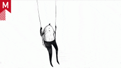
Mate Steinforth on “Ink”:
The style of the Ink spot is hand drawn, it feels like a line is continually drawing on, becoming the elements of the spot. This line is symbolizing the connection between the scenes.
Starting out with an exhaustive design process, we narrowed down the style to the perfect balance between illustration and photoreal shading. The colour palette is a desaturated blue-green, which emphasizes the inky feeling of the spot. Throughout the journey, the color gets progressively warmer and we end on a sun flooded end scene.
The most challenging aspect of this spot was to find the right balance in the graphical style and to make sure the pace of the spot flows nicely from one scene to the next. It was crucial to plan out the camera moves in a way so that the connections between the elements play a big role.
We used Softimage XSI for all the 3D Elements and went to After Effects to bring everything together and refine the elements. A lot of the magic has been done in compositing, ending with the final color correction.