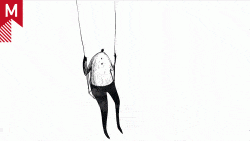
Steven Heller’s animated criticism of Olympic pictograms Posted February 25, 2010 by Bran Dougherty-Johnson Steven Heller’s animated criticism of Olympic pictograms (via Design Observer) ShareClick to share on Facebook (Opens in new window)Click to share on Twitter (Opens in new window)Click to share on LinkedIn (Opens in new window)