
During the cable boom of the 1990s, a flood of “niche” channels stormed the airwaves—each with its own allegiance to one particular genre. Now, it seems these specialty networks are abandoning this model, replacing their ultraspecific slates with more general, sometimes genre-spoofing programming.
High concept networks like The SciFi Channel have simply become “Syfy” and networks like AMC (“American Movie Classics”) — a channel once focusing strictly on classic film — have made a strategic decision to deemphasize, putting a more general focus on movies and paying big bucks for original content. IFC is no different.
As an early “niche” network, the once “Independent Film Channel” made its debut in 1994. Its aspirations were pure and intentionally snobby. Among the specialty tv landscape, their game-plan was simple: snub the mainstream and appeal to the arthouse crowd. Boom one year; bust the next.
The model worked, but by the mid 2000s, tastes were changing. Today, “IFC” stands for IFC. Nothing more; nothing less. No more highfalutin concept. No more “niche” limitations. In its place, the network still maintains an indie flavor, but offers programming that’s less artsy and more oddball. With its new non-ethos and ever ambiguous “Always On. Slightly Off” slogan, rebranding the network poses a unique set of challenges. Enter Gretel.
With a creative team led by Ryan Moore, Gretel had its work cut out for them. We recently caught up with Ryan to get the scoop on the studios network rebrand for IFC.
Interview with Gretel creative director, Ryan Moore
Lately, Gretel’s done a range of network rebrands. How does your experience with the IFC rebrand differ from others you’ve worked on?
Yeah, it has been a good range I’d say. There are so many differences each time out. Very different clients each with different needs. Distinctly different audiences too: pre-schoolers (Nick Jr.), fashionistas (Style), after-hours stock brokers (CNBC Prime), celeb-reality junkies (Vh1), and now comedy fanboys (IFC). No matter what, we tackle each branding job the same way. The fact that our process is the same, but the results can differ so dramatically is a point of pride for us.

Sometimes a network is just launching so they’re branding for the first time, the core values are clear and there’s no baggage to worry about. Some abrands evolve organically over time and we need to adjust the brand to reflect whatever new developments there may be. And some brands are pretty much broken – the message is so different from where the brand used to be that it needs reinventing altogether.
IFC was the second case: they shifted from indie film to cult classics and added a roster of original comedy programming. They wanted to show that they’ve grown into a bigger network, but they still have connections to their indie roots – it’s still very much a part of their DNA. So we wanted to create a brand that reflects the new material and growth without abandoning their legacy.
With any brand we try to boil everything we know about the brand down to its essence: the ethos of the brand. We come up with an appropriate metaphor internally that’s simple enough to be instantly getable but clever enough to have legs, and obviously something that reinforces the key tenets the brand stands for. The goal is the same every time out but of course the solution varies wildly from brand to brand.
For IFC, we kept coming back to the idea of the network as a venue. The kind of place that can host sketch comedy one night and movies the next. A venue bills talent, promotes the acts, curates the movie selection and never steals the spotlight from the headliners. This core idea informed everything from the logo to the endpage layouts, even the typography.
In your opinion, what is the key to a successful network rebrand?
For me it comes down to theme and variation. A brand, any brand really, needs to make an impression no matter what platform, format or scale. Every time. I think successful brands find ways to make that impression over and over without things getting boring or predictable. Same for network branding, you’re trying to build a system of visual and verbal guidelines to frame that impression. It’s always a balance of rigor and consistency vs flexibility and variety.

Scale is often a good test for us. Can the system scale up to a full-frame, 10-second logo ID, and all the way down to something like a lower third? On CNBC Prime I think we designed a seriously handsome lower third. Everything that made that brand work were represented in that tiny, often overlooked element.
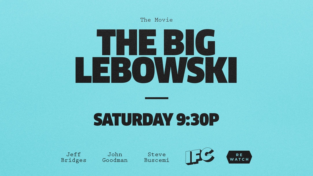
Same for IFC, in fact in the spirit of keeping everything ‘Slightly Off’ we did away with lower thirds altogether. All the messaging takes place within a vertically oriented ‘tag’ on the lower right, anchored around the logo bug. It might seem like a little thing, but as Greg (Hahn, owner and ECD) often points out, it gets more screen time than any other element on the air. It’s the one item on the deliverables list the average viewer is going to see most often. And it’s another opportunity to make an impression with them.
Specifically, for the IFC rebrand, what was the first order of creative business for you and your team?
We started, even before our first meeting with a kind of capabilities presentation / mood board. It was a showcase of some of our other branding work along with our impression of the IFC sensibility. The mood board itself was really more about tone, voice and trying to hit on the general IFC vibe than specific design but it gave us something to talk about right away.
Once we got the job, I suppose the first official order of business was actually crafting the brief. We worked back and forth with Kevin Vitale (VP of On-Air at IFC) and his team to nail down the goals, directives and the scope. While that was happening there was also plenty of everything else: logo and system sketching, writing, talking, and pulling and bucketing references, something we take pretty seriously and do a lot of on any job.
Early on it’s usually about nailing down that ethos… distilling it all down. From there we can start to hang language around that idea and start to develop the voice. Part of that is writing, part of that is research, and a lot of it is visual. It’s tone, language, point of view. By the time the voice is starting to work we’ll usually have the seeds of a few design systems. So we’re looking for ways to tie things together, what goes with what and why. There are times when writing leads to something visual, but just as often it’s the other way around. All that thinking and talking and pulling and sketching sort of seeps in and sooner or later something clicks. Sometimes all it takes is one frame, but sometimes it takes lots of other frames to get to that one.

Network rebrands require a lot of client service. Coexisting groups within the network itself may each have opinions and everyone from executives to producers; on-air design to marketing may have a seat at the table. How do you coordinate such a complex creative assignment and stay true to your vision?

I don’t think those two things have to be at odds, but of course you’re right that there are a lot of different masters the brand must serve. So, right on the heels of the brief we conducted a thorough brand audit. A big part of that meant speaking to everybody we could: Marketing, On-Air, Off-Air, Digital, Social, Scheduling, Research, Programming… anyone who worked with the brand day-to-day in any capacity. Hearing everyone’s opinions, experiences, frustrations, and suggestions firsthand – before talking design – was a massive help. It freed everyone up on both sides to throw out ideas and gave us some targets as we moved into design.
For example, multiple departments told us they needed some hard and fast design rules. Not options, not guidelines… some absolutes. Hence the two typefaces and the 3-color palette. There are more writers on the in-house team than designers, so language and type are a big part of the design. There was also an open question of how to brand their extensive, eclectic and rotating catalog of movies. We came up with a stamp system to sort and brand them in a ‘Slightly Off’ way. When you can start solving problems without breaking the system, then you know you’re onto something, and everyone on both sides starts to gets excited.
Todays network rebrands go far beyond television and extend to a multitude of screens. For IFC, where did Gretel begin its thinking and how was the rebrand translated across various platforms (on-air, web, mobile, etc.)?
Yeah, IFC has an avid following on social media and on their blog. That was one of the big insights to come out of the brand audit actually. We took inspiration from the way their blog is formatted and brought it to the air. Slicing, sorting and re-mixing content was a persistent theme. Top 5 Lists, Air Quotes, _____ in 10 seconds, they all reflect a Buzzfeed-y, blog-like approach to promoting content.
Chances are someone’s sent you a link to a Portlandia sketch at some point, right? IFC doesn’t have a problem getting traction with their content online. The challenge was getting people to realize Portlandia was on IFC. It was really about unifying everything, regardless of platform so you get a dose of IFC branding whether you’re on their Tumblr, watching Hulu, or looking at a poster. Dylan (Mulvaney, Lead Designer) put a massive amount of time and thought into making sure the brand translated across all those screens. Even into GIFs and business cards… I think it all hangs together really tightly. It’s consistent but it can still surprise you.
As of late, it seems the landscape of network branding is shifting away from bigger + bolder and instead, choosing more design-driven experiences. How do you see the state of network branding today and where do you see it going?
I would argue that it’s hard to get much bigger and bolder than Clan Narrow Ultra at 300pt…
But sure, I would agree there’s a shift. I think it has more to do with the relationship between viewers and networks though than anything aesthetic. VOD, delayed viewing, streaming and mobile are changing that relationship, but it’d be hard to argue that networks aren’t still delivering great content. What it means to be a network today has less and less to do with cable boxes and TV screens, and I think it’s pretty clear that the future means digital delivery. Smart brands (IFC included), smart advertisers and smart designers are already adapting. I suppose it’s all just leading to Skynet, right?
Finally, after creating a fully functional system for IFC, how do you manage the transition of deliverables to on-air? Typically, are each of the graphic elements sent over as a toolkit and so far, how has the handover experience been between Gretel and IFC?
Yeah, with any rebrand that’s a big part of the challenge for any platform, including on-air. You can’t build everything, you’re building the tools that other people will use to build the rest. You have to make sure those tools and the brand guidelines that go with them are clear, user-friendly and inspiring. You want people to want to use them.
In this case we were talking about more than just identity guidelines and AE files, we had created ID recipes, language guidelines, promo structures… lots of guiding principles for creating elements along with the elements themselves. We always build in time for testing well before launch, so for IFC we delivered a limited toolkit of elements for their on-air team to work with. When you’re pressure testing like that it doesn’t take long to realize what’s working and what can be better.
Chase (Massengill, Lead Animator) worked extensively with the IFC on-air team during that testing phase. Knowing the in-house team was lean on the design and animation side, and needed to produce a big volume of work in a short time, we were able to deliver ‘smart’ AE files as part of our toolkit. Color palettes, animation styles, durations, and even type animations are all dynamically scripted so they can be updated with a checkbox here, a slider there etc. We wanted their team to be able to focus on writing and editing without getting bogged down technically. So far it seems to be working beautifully. The IFC team has really embraced the package and what you see on their air is dead true to what we delivered.
Gretel Credits
- Client: IFC
- Strategy: Gretel
- Design + Animation: Gretel
- Original Music + Sound Design: Huma-Huma
- Typefaces: Clan Narrow Ultra, Prestige Elite Bold, Gotham Bold