
At the end of 2021, one of the most prominent banners in Times Square played a promotional video in honor of the release of the third season of “Narcos.” The video spread around social networks and was remembered by the audience for its bright dynamics, reminiscent of a passionate Latin American dance.
The Motionographer editors contacted the animation team to find out how this promotional video was created.
Designing letters from scratch
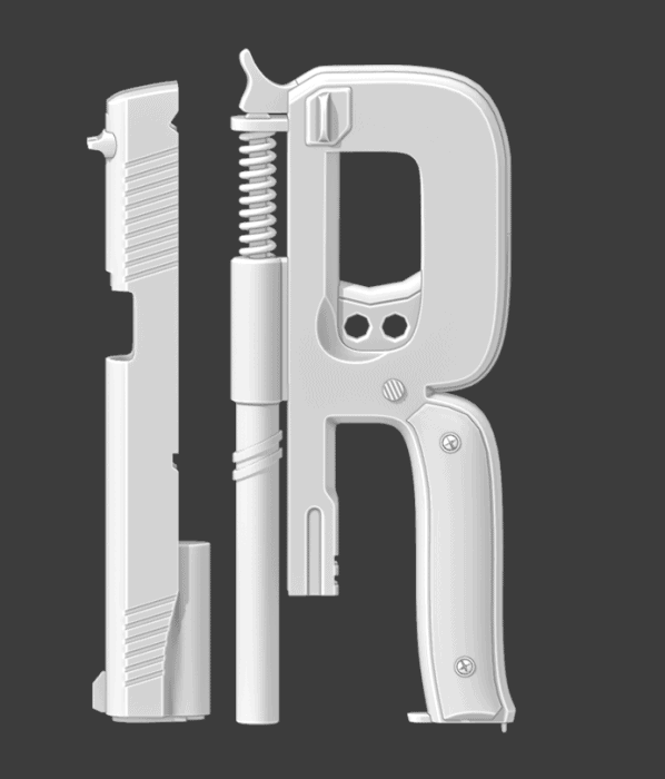
“Actually, the project started not from animation. Originally we got a request from our colleagues and partners from Rhubarb Agency on poster creation. Based on the task, we had to design the letters of “Narcos” using popular weapons and jewelry as the main references,” – Dmitriy Glazyrin, art director and CEO of Mondlicht Studios.
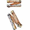
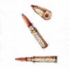
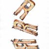
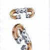
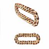
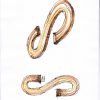
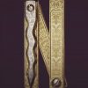
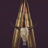
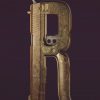
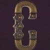
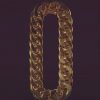

That’s how the letters of “Narcos” turned into a chain, gun, knife, and bullet. However, the studio went much further and enhanced the models with unique patterns created by CEO and concept artist Maksym Khirnyy.
“As a designer in the broadest sense, I always look for very non-typical sources of inspiration. For example, the patterns I used for the letters were inspired by the wallpapers from the early 20th century.”
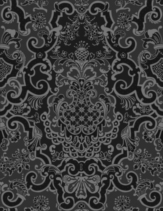
“At that time, the most expensive wallpapers were made of leather and often adorned with precious and semi-precious stones,” – tells the artist.
For visualization, the team used Redshift, as it allows you to achieve greater speed in conjunction with Cinema4D, which was very important during this project. The main materials were gold, copper, and silver.
Although each material was simple, the team invested a lot of time in creating textures and masks. It was essential to ensure that each letter looked beautiful and unique. The balance between the simplicity of materials and the creation of interesting accents helped to achieve the result.
Working on animation
After the poster was approved, the studio started to work on animation. The team launched all possible processes in parallel to finish the project on time. For example, while the modeler worked on the letters, the Motion Designers put together the animatic.
Before coming up with the main concept, the studio team tried several options. For example, one option was to place the letters in a sandy location.
Even though this idea had potential, the studio’s art director concluded that he wanted to find a stronger and more readable concept.
“When creating any project, everything always rests on the idea. The idea is just as important as the quality of the render, whether it’s an animation or a single image. In the case of the video, we have chosen the path of associations with Latin American culture, one of the main components of which is a dance,” - Dmitry Glazyrin.
The studio team led by Dmitriy Glazyrin and Vitaly Yakin chose the passionate dance of Antonio Banderas from the movie "Take the Lead" as the primary reference. Based on a moment from the film, generalist Arthur Nalobin managed to build the dynamics in each frame - the "dance" of the letters is read even without music, which was especially important, given the specifics of the video placements.
"When building an animation like this, it is crucial to both keep the big picture in mind and hold on to individual frames for maximum results. For example, in this case, the interaction of objects was critical. In 30 seconds, we had to convey the atmosphere of the Mexican mafia - full of danger and passion. All this became possible only thanks to the thorough work on each frame - the "letters" do not just dance; they collide, hit each other, move away and approach again. Between all this, a real intrigue is read," says Arthur.
The team did the final editing and post-production in DaVinci Resolve - this is an excellent software for delicate work with color and creating the final atmosphere. Thanks to his node system, an artist gets all the tools for perfect and soft tuning.
“First, we invested enough effort into the render itself so that it already looked good on its own. We also got a realistic volumetric from Redshift to add the volume, rather than using a Z-Depth map, as many used to do. Masks were prepared for each of the materials to allow flexibility in post-production. Since there were few materials, the choice fell on Puzzlemate instead of Cryptomatte. Smoke simulations were also created separately. As a result, we got the opportunity to very gently adjust the color correction of almost every element and assemble the entire video at the compositing stage,” - says Dmitriy.
“It was amazing to look how the team was working on the project! When we saw the video on Times Square and on official social media of the series, we were incredibly happy. After all, “Narcos” is one of our favorite series,” - Zhanna Travkina, producer at Mondlicht Studios.